Hound PA
USER RESEARCH | HEALTHCARE | WEB
SaaS dashboard to assist in organizing and maintaining patients during Prior Authorization process.

ROLE
Product Designer
TEAM
Product Owner
Business Analyst
Architect
Developer
DELIVERABLES
UX Audit
User Flow
Customer Journey Map
Low Fidelity Designs
High Fidelity Designs
TOOLS
Sketch
Invision
Miro
Figjam
THE PROBLEM
A headache and migraine clinic struggled to track clients effectively through the Prior Authorization process, resulting in client loss.

A medical spa in central Ohio had an overwhelming number of patients interested receiving botox for debilitating headaches and migraines. However, receiving Prior Authorization (PA) for their medication was a complex process impacted by a number of factors.
Image source : Unsplash
How can we improve customer retention and effectively monitor their progress as they receive Prior Authorization and Botox for migraine treatment?
SOLUTION
Create a digital tool for internal staff to more effectively track and manage patients by stage and specific tasks required.
Key Features
-
Cloud based and accessible in multiple office locations
-
Dashboard summary overview organized by number of clients in each stage and the number of days in said stage
-
All patient profiles require a new assignment upon completion of tasks in a stage.
-
Patient profile pages convenient source for all patient info and notes in process.
Project Goals
-
Audit existing tools and identify pain points.
-
Understand business objectives, PA process, and user experience.
-
Document findings in customer journey map to identify opportunities.
-
Provide design solutions, brand product and work with development to implement.
UX AUDIT & PAIN POINTS
Current tools utilized by the client lacked good design and robust functionality.
The primary tool staff were using consisted of an excel spreadsheet adapted from a ‘Patient Tracker’ document created by Botox specifically for providers. The patient coordinator attempted to incorporate the stages unique to their process but it quickly became cumbersome and difficult to use.

Top image source : Botox patient tracker
Further analysis of their tool revealed the following pain points:
Multiple tools used at different locations led to inconsistent tracking of patients in process.
Design and layout inaccurately captures unique non-linear patient journeys, leading to patients revisiting previous stages getting lost.
Inaccessible color contrast, small text size, and vertical scrolling all contribute to visually busy design that is difficult to review.
Inability to easily detect how long a patient has been in any given stage and what most recent actions were taken.
Static record of patient steps and details lacks functionality to assign staff to patients and deadlines for patient tasks.
Lacks space to capture contextual details for patient and steps assigned for previous and current patient tasks.
STAKEHOLDER & USER INTERVIEWS
Balancing business and user needs: management's desire for high-level overview and the front desk staff's to drill down in detail.
We began understanding the business’s needs over multiple discovery meetings with stakeholders. Upper management prioritized seeing an overview of the number of patients in each stage and the ability to hold staff accountable by accessing staff’s assigned patient case load.
"
"
...staying on top of our staff, what are they doing vs what they should be doing
President and General Counsel


...need to see an overview of what’s going on before getting in the weeds...
Owner
"
...need to see particular patients who are not progressing
Patient Coordinator

Interviewing the Patient Coordinator revealed a shared desire for a big picture of patients, as well as more granular needs. Given their role, they would be a primary user of the product, and expressed a desire to capture more detailed information regarding the patient’s journey, such as their insurance info and a place to store annotated notes for various steps in each stage.
USER FLOW
Understanding the different paths to obtain and administer Botox to treat migraine patients.
It became evident in interviewing the Patient Coordinator that there were many avenues and dependencies in the the process of receiving Prior Authorization to acquire and administer botox. Using the information they provided I created a user flow to reflect all these potential stages a patient could undergo in the process.

User flow diagram created with Miro.
CUSTOMER JOURNEY MAP
Thoughtful and thorough documentation to empathize with the user experience.
After better understanding the PA process for the patient I created a customer journey map to organize each stage with its corresponding actions, goals, touchpoints, emotions, pain points, and opportunities.

Customer journey map created with Miro.
After the interviews and customer journey mapping I worked closely with the Business Analyst on the project, who detailed features and requirements in confluence. This research built a strong foundation to move into the design phase.
IDEATION & DESIGN
Utilizing research findings from the discovery phase to initiate the ideation process with design opportunities.
I frequently referenced all the aforementioned documentation as I started to create sketches and eventually high fidelity mock-ups.

Images of ideation: sketches, low fidelity, and high fidelity iterations for two of the three main screens in the web application.
Changes in the final high fidelity designs are due in part to the following factors: MVP feature prioritization, requirements, developer recommendations, and feedback from internal design reviews.
HIGH FIDELITY DESIGN FEATURES
Crafting design features that effectively address user paint points and align with business requirements.
Creating a cloud based web application immediately resolved the issue of multiple tools and inconsistent information. Solid design principles greatly enhanced the experience, featuring clean, intuitive layouts and accessible text sizes with adequate color contrast for easy review of patient information.The enhanced functionality of creating cards for steps within each stage marked a significant improvement from the spreadsheet.
Highlighted below are key features and pages that addressed the client's patient leakage.
1
Homepage dashboard focuses on patients with no recent activity in each stage.

-
Helps the user understand the number of patients in each stage
-
Sorted to prioritize patients with longest number of days in each stage.
2
Patient database organized by stage with advanced filtering.
-
Linked to dashboard card view
-
Top level navigation reflects progression of stages
-
Ability to drill down deeper and find patients by office location, health insurance path, last activity, etc.

3
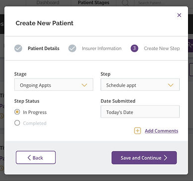
Patient profile requires adding a new task after completing a step.

-
Upon completion of an assigned task, user selects next stage and/or step required.
-
Creates accountability to ensure all patients are being tracked (eg patients past PA process receiving routine treatment and nearing PA renewal date)
4
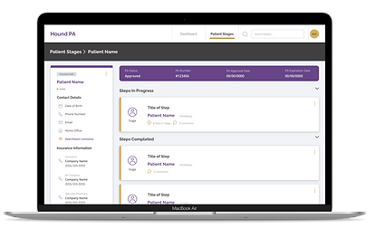
Patient page prioritizes critical PA info and convenient access to relevant patient information to complete tasks.
-
Page highlights PA number, approval status, and expiration date
-
Ample opportunity to document notes relative to patient, patient’s insurance companies, and patient task assignments (past and present).

BRANDING, STYLEGUIDES, & UX REVIEWS
Enhancing brand palette for color accessibility and utilizing design system documentation.
The client’s primary brand colors included black, white, yellow, gold and pink. They marketed their headache and migraine center as a distinct service, allowing flexibility from their original brand guidelines. Considering this, along with the goal to establish a more accessible color palette, I introduced a new primary color (purple) and used yellow as an accent to indicate interactive elements. Throughout component creation, I often consulted the design system documentation for Prime React, and designed a UI kit with similar styles to the default application framework to streamline development time.


Image gallery of the styleguides released and reviewed with the developer for design consistency.
Sample UX Review

The first image is the high fidelity design uploaded on Invision for the developer to reference in development, the next image is a screenshot from the first UX review.
Some of the feedback shared with the developer during this UX review
-
UX writing inconsistencies (header text and text link language incorrect)
-
Stepper - top/bottom border missing, inaccurate font weight for current step, missing icon for completed step
-
Inputs - bottom padding of label text too small, chevron color inaccurate, input bg color inaccurate, margin too tight between columns of inputs and top/bottom of inputs within columns, active input border color inaccurate (still prime react default)
-
Buttons - missing arrow icon
-
Dialog - Margin above and below text link button too tight, grey footer background missing
Client Feedback
"
“I think it looks great, really self-explanatory, really user-friendly”
“Super easy to use”
“You included everything...it looks great”
CONCLUSIONS
Valuable experience gained + next steps
-
Balanced extra time for discovery by reducing testing time later, prioritizing efficiency by minimizing revisions.
-
Limited high-fidelity design updates to essential screens and styleguides to also optimize time and budget.
-
Collaborated closely with the Business Analyst, enhancing the success of the discovery phase and business requirement establishment.
-
Gained valuable experience in honoring stakeholder priorities while also directly addressing the main users’ preferences and desires for the product.
-
Future release to include: notifications, staff messaging, step priority assignments, and patient profile enhancements.
